Partial links are inaccessible
It's easy to create links which aren't quite accessible due to lack of context, and it's even easier to fix!
Navigating through any website, you’re bound to find partial links. I consider partial links to be links which do not contain enough text content to make them discernible from other links.
A quick example of a partial link would be the following:
<p><a href="/abt">here</a></p>In the example above, you wouldn’t be able to tell where the link would direct you to, as there’s no “proper” context describing it, nor is there enough text content. For some, there’s usually context before or after the link, so that they can make a informed decision of clicking that link or not:
<p>See more on our about page <a href="/about">here</a>!</p>
<!-- The link does not describe its purpose itself -->
While that may be okay for some, a user who uses some form of assistive technology may not be able to get to that context preceding the link in the example.
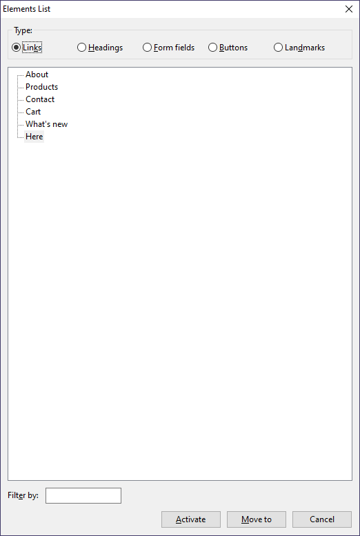
This is because some users may navigate a page through links. Maybe they’re trying to find a link that they’ve been to before, or some other scenario. When using a screen reader, you can navigate between landmarks, form elements, links, etc. When navigating through links, the example above would be listed as "here", without the context that precedes it.

Example of the "Links" view in NVDA Screen Reader Elements List.
This is also listed as "success criteria" for WCAG 2.1, that criteria being Link Purpose 2.4.9 (Link Only) and/or Link Purpose 2.4.4 (In Context).
It’s also good to note that you do not have to be super specific when creating text content for a link. It’s better to give that link a short amount of context to describe it as well as text content, so that an AT user, (or any user) can perceive that link quicker.
How to make it accessible
Here’s a few things we can do to ensure that we’re making a link accessible by its text content.
-
Ensure that the link text describes its purpose
For example, if your link contains “here”, or “read”, or even “click me!”, then it doesn’t describe the purpose of the link; what exactly am I clicking? Ensure that the link describes where the link will take the user, an example of short and efficient text content being: “About us”, “More information on our product”, “Our values”.
-
Ensure that the link has a proper accessible name
Some links are inaccessible because they don’t contain any accessible text at all. An example being, if your link contains only an image without a descriptive alt text, or text alternative, then a user using assistive technology may not be able to figure out where that link will take them.
-
Make sure it isn't too verbose
It's easy to give a link too much text content. Giving links short text content which describes the link fully enough so that any user can determine where it will take them is key.
In most cases, partial links are caused by only factoring the visual aspect of that link. For example, if you only give the context "here", you’re assuming that the user is going through the navigational flow in order to receive the context for it. Though, this is disregarding the fact that users may navigate through links, missing out on that additional context.
Giving links better context helps us all, as some users may be able to better distinguish between that link and others visually, as well as via using AT.
Further Reading
With that, I hope I helped you learn something new regarding web accessibility! Here’s a few links that I think may supplement this post.